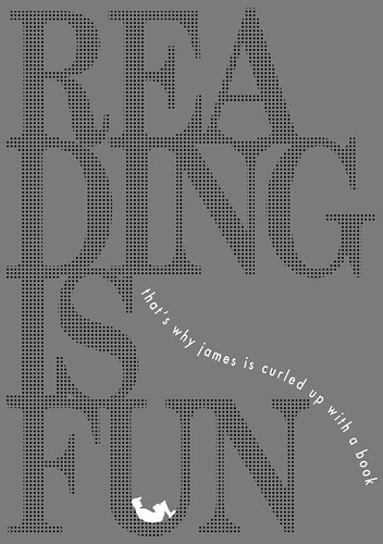
it really is - design by J amps
It's that time of the year for Read Singapore again - but hey, why wait for some government agency to tell you to read (in caps and with an exclamation, no less) before you do so? This year, amps bring you another poster on why reading is what it is.
But I wonder if there can be folks who love books but don't read, bibliographers who judge the book by its cover, weight, smell, texture, size, font, layout...and love everything but its content. Ah, surely it would be a fleeting, superficial love. Or lust.
So it was with some skepticism that I read this article in the Design observer about attempts to arrange books by colour.
"For one, books he's purchased or received as gifts are books he knows and often loves, and the color of these books is a major part of the experience of interacting with them [...] Another of Luke's reasons is this: organizing his books by color allows him to discover new and unexpected relationships between books he knows well already. When two unrelated books are forced to occupy the same shelf simply because of their spine color, the shelver is asked to think about whether they have ideas to share between them." (extract from the article by Rob Giampietro)
I guess as an experiment to place style over meaning (and whether new meaning emerges) may yield random interesting results, but poor Dewey will have such a fit!
 Yet there is also no one way of arranging your bookshelf - how you do so reflects your experiences, biases, priorities.
 For me, poetry deserves its own shelves. As do graphic novels and their gradual melding into a long series of art, illustration, design and photography books (the greyness of these borders mirror too the disciplines' own inter-mingling) before transiting via Maurice Sendak to 2 other shelves of children's books. American writing stands distinct from everything else in chronological fashion - reflecting, aiyah, America's cultural imperialism and my own bias! The English too, stand apart - an island onto themselves. Chinese writing (I've unfortunately not made a distinction with Taiwanese text, against my belief that Taiwan should remain its own green island) spills into the rest of Asia, as is the case today with everything else made-in-China, leaving only Japan and those translated Japanese texts providing a balance of power. The Italians, talented as they are, share the space with the Latin Americans and Central Europeans. And exiled to the pitiable depths of the floor-height shelves are books I don't wish to have any claim over - management texts and advertising books.
And there's still the reading to do.
============
p/s Feel free to download the posters from 2006 and 2005.


No comments:
Post a Comment